UX revamp
We Redesigned LawDocsOnline. Here's What Trust Looks Like in Legal Templates.
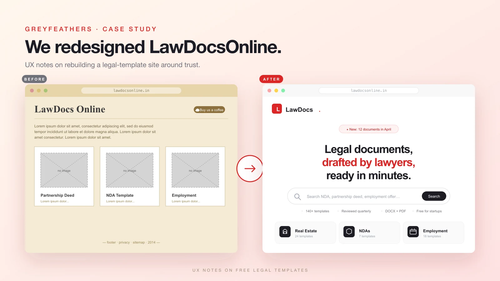
Lawdocsonline.in is a real library of free lawyer-drafted templates wrapped in mid-2010s WooCommerce chrome. We rebuilt the front-end around one question: would a founder trust this site enough to download a contract from it?
In April 2026 we landed on lawdocsonline.in while researching legal templates for a different client. The library is real: lawyer-drafted partnership deeds, employment letters, SHA templates, NDAs. More than 140 documents across thirteen categories, all free, reviewed every quarter. Every Indian startup would use this if they knew it existed.
The website did not communicate any of that. Default WooCommerce theme, lorem ipsum body copy, broken product placeholders where document covers should be, a 'Buy us a coffee' tip jar as the only call to action. The contrast between substance and surface was so steep that we sent the founder a redesign the same night, unsolicited.
This case study is about that redesign. Not the visual choices, but the UX choices behind them. The question we kept asking ourselves: would a founder three weeks from incorporation trust this site enough to download a Founders' Vesting Agreement and use it?
Inside the LawDocsOnline UX revamp: trust, search, and a wrong turn with italics
1. The original site's three problems
The first problem was visual hierarchy. The homepage had thirteen category cards, a testimonials section, an about block, and a coffee tip jar, all weighted roughly the same. Nothing told a first-time visitor where to start.
The second was placeholder content. Lorem ipsum does not read as 'we will fill this in later'; it reads as 'this site is unfinished'. For something as trust-dependent as legal, that is fatal. A founder evaluating a contract draft is looking for signals that competent people maintain this catalogue. Lorem ipsum says the opposite.
The third was the WooCommerce broken-image placeholders where document thumbnails should have been. A grid of grey rectangles labelled 'Partnership Deed' does not communicate anything about the document inside. The reader has to click through to learn anything, and most never do.
Three problems, one root cause. The site was built like a generic e-commerce store, but legal templates are not an e-commerce category. The reader does not browse, they search. They do not compare prices because there are no prices. They are not building a cart, they need one document right now. The taxonomy inherited from the platform was fighting the job to be done.
2. The brief we gave ourselves
One sentence: a founder lands on this site, and within thirty seconds, feels safe enough to download a contract and sign it.
That ruled out a lot. No carousel of generic legal stock imagery, no gavels, no scales. No 'trusted by 10,000+ users' stat block unsubstantiated by anything. No paywall, not even a soft one. No newsletter modal. No cookie wall asking for marketing consent before the user knew what site they were on.
The brief also defined what needed to be up front: who drafted the documents, how recently they were reviewed, whether they are India-compliant, and what format you would get on download. We made each one a one-line label shown before the user does any clicking. The hero stripe says it all: 140+ templates, reviewed quarterly, DOCX + PDF, free for startups. The brief written in micro-copy.
3. Search before browse
We put the search bar in the hero, not the header.
This sounds like a small thing. It is not. The original site relied on the user reading the category list and self-classifying their need: 'I want an employment agreement, so I click Employment.' That works if you know what you are looking for at the category level. Most founders don't. They know they need a 'founders vesting agreement' or a 'DPA for our SaaS contract'. Specific document names, not categories.
When the search bar is in the header, it reads as a utility, same weight as the menu. When it sits in the hero with the placeholder 'Search NDA, partnership deed, employment offer…', it reads as the primary action. The category grid is still below it for users who want to browse, but the default flow is now search.
The placeholder text matters too. We did not write 'Search documents…'; that is a UI label. We wrote three example queries because they double as a discovery hint: the site has these things.
4. Thirteen category icons that signal type
Each of the thirteen categories got a single Lucide icon: Building2 for Real Estate, Scale for Power of Attorney, Handshake for Partnership, Shield for NDAs, Briefcase for Employment, and so on. They are not decoration. They are wayfinding.
Three rules we held to: every icon had to be a single concept (no composites, no 'scale-plus-building' mashups), every icon had to render at 20px without becoming a blob, and every icon's metaphor had to be discoverable in under a second by someone who had not read the label. We rejected two early picks, a generic file icon for Notices and a too-clever balance icon for Investment, because both failed the one-second test.
The category cards also show the template count next to each icon: '24 templates' next to Real Estate. This tells the reader two things: which categories run deep, and that the catalogue has actual breadth. A category with three templates would read as anemic. During an earlier draft we left the count off the Notices card, and reviewer feedback was that the category felt thin, even though it had thirteen templates. Showing the number rebuilt the perceived depth.
5. Trust signals on every card
Most catalogue UIs hide trust signals on a separate About page. The bet there is that users who care will navigate to it. They won't, at least not before deciding whether to download.
So we lifted the signals onto the cards themselves. Every document detail card shows the page count, the format (DOCX or DOCX + PDF), the date it was last updated, and the jurisdiction where relevant. Every category card shows the template count. The site-wide hero shows the four trust labels above the fold.
The 'Newly added' dark section reinforces this with a different kind of trust: recency. 'Fresh off the lawyer's desk', with each post-card dated. The implicit message is that the catalogue is maintained, not abandoned. Quarterly reviews aren't a marketing claim if you can see them happening.
6. The 'Fresh off the lawyer's desk' rhythm break
Catalogue pages have a rhythm problem. If every section is a light-background grid, the page reads as one long spreadsheet. The eye doesn't know where to pause.
We slipped one dark section between two light ones, exactly in the middle of the scroll: 'Fresh off the lawyer's desk', showcasing the four most recently added templates. The change in luminance forces a beat. It also gives the recency signal a stage: a dark section reads as featured, where a light one reads as just more catalogue.
The rest of the page rhythm is light, dark, light, dark, via card colours and a deep-red-to-ink CTA gradient near the bottom. None of these are decoration; they are navigation aids. A founder skimming this page should know where each section begins without reading a single heading.
7. The download page is the conversion
The category and home pages are funnels. The document detail page is the conversion. We treated it that way.
The layout is two columns. The left has the title, a one-paragraph summary, and a 'What is inside' checklist with five bullets: recitals, obligations, carve-outs, governing-law clauses, and signature blocks. The right is a sticky sidebar with format, pages, last-updated, and jurisdiction, with a single 'Download free' CTA below them. Underneath the CTA, in smaller text: 'No signup required'.
The lawyer disclaimer sits between the two columns, not below them. 'This template is a starting point, not legal advice. Have a lawyer review the final document before you sign.' It is the second most-read element on the page after the title. Burying it in a footer is the lazy choice; it also undermines the trust we worked to build above. The disclaimer is part of the value, not a legal CYA.
We did not require an email to download. Every other free-template site we audited uses a soft paywall: enter your email to get the PDF. The founder paying attention notices that their work is the product, not yours. So we made the contrary choice loud. No email, no signup, no upsell. Download free means download free.
8. A wrong turn with colour and type
The first cut used a deep indigo brand colour and an Instrument Serif italic for display type. We thought editorial-meets-law: the italics nodded at case-law citations, the indigo felt premium and stable. Two minutes after the demo, the feedback came back: 'that italics font sucks, keep the red and white'.
It was the right call. The original lawdocsonline.in is red, and that is its identity in the user's memory. Replacing it with indigo was novelty for novelty's sake, a design choice that makes a portfolio piece but loses brand recognition. Poppins, the preferred display, reads as friendly-modern rather than legal-formal, which suits a site whose audience is founders, not lawyers.
We swapped the entire brand palette to red shades (#fef2f2 through #7f1d1d) and replaced both display and body type with Poppins. Most of the gold accents we had used as a third colour became red tints. The page lost an axis of variety but gained a clear identity.
Lesson, sharply put: brand recognizability beats novelty when the topic is trust-dependent. A redesign that ships a stranger to your audience is worse than no redesign.
9. What's next
The current build is the front-end revamp. The R2 wiring is plumbed but unfilled. We built the infrastructure for documents to live in Cloudflare object storage with presigned URLs for downloads, but the actual templates still need to be uploaded. The download API returns a clear 'R2 not configured' message until they are.
Three things on the follow-up list: real document uploads, a stamp-duty calculator that estimates the cost of registering common documents in each Indian state, and an email-the-lawyer escalation path for templates that need a redline. The last one is the bet: free templates are a top-of-funnel for legal services, and the redesign makes that path feel natural rather than transactional.
Questions about the project
Is this a real client engagement, or a concept?
Concept. We sent the redesign to lawdocsonline.in's listed email as an unsolicited pitch. They haven't responded yet; this case study is going up either way.
Will lawdocsonline.in adopt the design?
Their call. The codebase sits in our potential-clients folder, and we can hand it over as a turnkey deployment if they want it. If they don't, we keep it as a public showcase.
What's the stack?
Next.js 16 with App Router, React 19, Tailwind v4, framer-motion for entrance animations, lucide-react for icons. Cloudflare R2 (S3-compatible) for document storage via @aws-sdk/client-s3 and presigned URLs. Hosted-anywhere by design.
Why Cloudflare R2 instead of a CMS?
Documents are large, mostly-static binary blobs. They don't need a CMS, they need cheap object storage and a fast CDN. R2 gives both, costs around $0.015 per GB per month, and has free egress, which matters for a free-download site. A CMS would add complexity and monthly cost without solving any problem we have.
Are the documents in the demo real?
The category structure and document titles are real, pulled from the original lawdocsonline.in catalogue. The actual DOCX and PDF files behind them are not uploaded yet. The download endpoint will redirect to presigned R2 URLs the moment they are.